Why Responsive Web Design Is Crucial for Meeting User Expectations
Why Responsive Web Design Is Crucial for Meeting User Expectations
In today’s digital world, users expect a seamless experience when browsing the internet. Whether they’re searching for information or making online purchases, they want websites that load quickly and are easy to navigate on any device. That’s why responsive web design has become crucial for businesses of all sizes. A website that is not optimized for different screen sizes and devices can lead to frustrated users and lost business opportunities. In this article, we’ll explore why responsive web design is so important in meeting user expectations and how it can benefit your business in the long run.

Introduction to Responsive Web Design
Responsive web design is crucial for meeting user expectations because it allows your website to adapt to the different screen sizes and devices that users are viewing it on. This means that whether someone is viewing your website on a desktop computer, a tablet, or a smartphone, they will be able to read and navigate your site without any problems.
Creating a responsive website is not as difficult as it may seem at first. There are many resources available online that can help you get started, and once you have the basics down, you can begin customizing your site to better suit your needs.
If you’re not sure whether or not responsive web design is right for you, take some time to browse through some responsive websites and see how they look on different devices. You may be surprised at how well they work, and how user-friendly they can be.
Benefits of Responsive Web Design
As the world increasingly turns to mobile devices for web browsing, it’s more important than ever for companies to have a responsive web design. A responsive web design automatically adjusts its layout to fit the screen size of the device it’s being viewed on, whether that’s a smartphone, tablet, or desktop computer. This ensures that users have a positive experience on your website no matter what device they’re using.
There are several benefits of responsive web design:
- User experience is improved on all devices: As we mentioned, responsive web design leads to a better user experience overall because users will always be able to view your site in an optimized format no matter what device they’re using.|
- You only need to maintain one website: Maintaining multiple versions of a website (one for desktop and one for mobile) can be time-consuming and expensive. With a responsive website, you only need to maintain one site.
- SEO is improved: Google favors websites that are responsive because they provide a better user experience. This can lead to improved search engine rankings and increased traffic to your site.
- Costs are reduced: As we mentioned, maintaining multiple versions of a website can be costly. By having a responsive website, you can save money in the long run by only having to pay for one site instead of two (or more).
How Responsive Web Design Enhances User Experience
Responsive web design is the process of designing and coding a website so that it responds to the dimensions of the device it is being viewed on. This means that whether a user is viewing your website on a desktop computer, a tablet, or a smartphone, they will have an optimized experience.
The reason why responsive web design enhances user experience is that it ensures that your website looks and functions its best no matter what device someone is using. With more and more people accessing the internet from mobile devices, it’s crucial to have a site that looks great and works well on all devices.
If you’re not sure whether your website is responsive, you can use Google’s Mobile-Friendly Test to check. If your site isn’t responsive, now is the time to make some changes so that you can provide an optimal experience for all users.
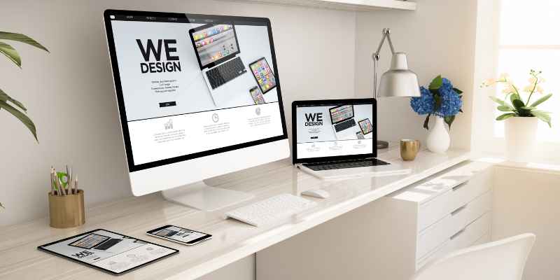
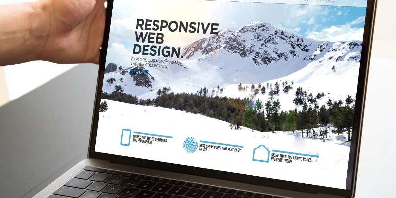
Examples of Responsive Website Designs
This site features a clean design that is easy to navigate on any device. The layout automatically adjusts to fit the screen size, making it easy to read and interact with on any size device.
This website is another great example of responsive design. The site features a simple layout that is easy to navigate on any size device. The layout adjusts automatically to fit the screen size, making it easy to read and interact with on any size device.
This website’s homepage is a great example of responsive design in action. The layout adjusts automatically to fit the screen size, making it easy to read and interact with on any size device. The navigation is also easily accessible on any size device, making it quick and easy to find what you’re looking for no matter what type of device you’re using.
Tips for Developing a Great Responsive Design

- Make sure your site is accessible on all devices.
- Use a responsive design framework.
- Use media queries to target specific device sizes.
- Optimize your images for different screen sizes.
- Minimize the use of plugins.
- Use a fluid grid system.
- Use CSS3 media types.
- Include a viewport meta tag in your HTML code
Conclusion
In conclusion, responsive web design is an essential tool for any website to have in order to ensure that customers get the best possible experience. With the increasing prevalence of mobile devices, responsively designed websites are more important than ever. Responsive web design ensures that user expectations are met and makes it easy for customers to access content on a wide variety of devices. If you’re looking to make sure your website is meeting user needs, implementing a responsive web design should be at the top of your list.


